Brand guidelines
Warm, whimsical,
wise
How we look, sound and explain things, on slides, the website, courses and everything else we make.
Our brand in three words

Welcoming, never corporate.

Playful, because humans and collaboration matter.
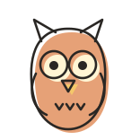
Simple and clear, so hard topics feel easy.
Warm
Cream paper, soft pastel washes and friendly faces make everything we put out, from slides and the website to courses and posts, feel welcoming, never corporate.
- Paper, not white screens
- Pastel washes, not flat corporate colour
- We talk like a person, not a press release
Whimsical
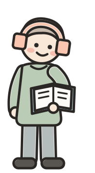
Wobbly ink, marker lettering and friendly doodles balance the mechanical, systems-heavy ideas in our trainings with a playfulness that reminds everyone that humans and collaboration matter. Nothing is perfectly symmetrical: heads tilt, ears and hands don't match, and faces sit a little off centre, so it looks drawn by a hand, not a machine.

Wise
Simplicity and clarity first, with one idea at a time, steps in a clear order and simple, familiar images, so even hard topics are easy to understand.
One idea per slide, section or post.
Numbered steps that read in order.
Everyday objects to explain abstract things.
Words normal people use. Jargon only when needed, and explained clearly and concisely.
Colour
Five main colours. For numbered steps, this order keeps a series consistent, but it’s a habit, not a rule.
Supporting colours: headings, arrows, highlights and paper. Don't invent new ones.
Type
Big titles are always capitals and sit on a highlighter swash. Everything else is sentence case.
The wobbly line
Every outline wobbles, but only a little: just enough to feel drawn by a person, never messy.
- Thin lines: bubbles, panels, arrows, doodles
- Chunky lines: character outlines
- Never turn the wobble up
Pictures: objects first
To explain an idea, draw a familiar thing: thin wobbly ink over a watercolour wash. Use one colour for simple objects and up to three when an object has distinct parts, always from the palette. New objects are welcome.













Characters: supporting cast
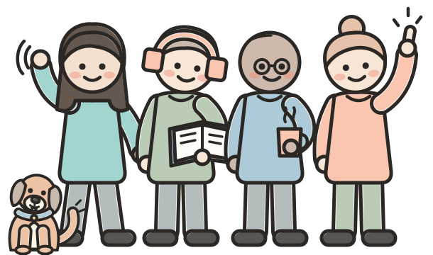
A chunky clean outline with a pastel wash.
- Small and at the edge, never the centrepiece
- Always doing something: reading, waving, pointing
- A mix of people who look like our learners
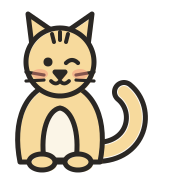
- Groups show collaboration; the cat and dog add a smile
Do & don't
- One idea at a time
- Use the kit's pieces and colours
- Explain with everyday objects
- Leave space: paper is part of the look
- Stock photos or glossy gradients
- New colours or fonts
- Big cartoon mascots front and centre
- Extra wobble for “more fun”
Get the kit
Every piece in this deck is plain HTML, CSS and SVG, ready to copy.